Tips for Teacher Websites #3: Going beyond the basics
Another day, another post completing a trilogy. This time, we're taking a deeper look at some things you can do beyond the basics for both SharePoint and Google Sites. As mentioned in both post #1 (Know Thine Audience) and post #2 (Form and Function), I suggest that teachers get a firm grasp of their website's audience and then determine the type and amount of content they wish to maintain. With those elements in place, layout, design, and colors can become a focus, and often, this is where the fun and exciting part of creating a website really comes into play.
SharePoint
 One of the first comments that teachers often make regarding SharePoint sites is how "blah" it looks or how clunky the program feels. Fortunately, once you become familiar with some of the options available through the Site Actions, Site Settings menus, you do have some flexibility in terms of layout, HTML embeds, and design. Here are some examples from our teachers:
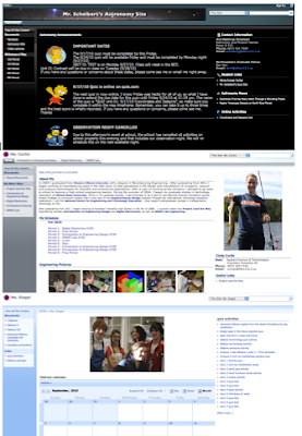
Mr. Schelbert: A custom header, images in the announcements, and a detailed calendar immediately stand out to the viewer. Useful links (also with customized icons) appear on the right while document libraries (including ones for each class with lecture notes) are stored on the left.
Ms. Curtis: An "About me" web part, schedule in the center, and a clever use of the content editor webpart (rather than the clunky photo web part) to organize a layout for photos. At the top are tabs for classes, with a new site/workspace created for each one.
Ms. Siegel: Not necessarily innovative in design, but full of content, specifically integrating Quia links as well as document libraries full of presentations and files for audio vocabulary lessons.
 As an alternative to SharePoint, and often the first option I recommend for teachers nervous about creating a website or just looking for something simple, we have Google Sites. With single sign-on, there's no need for additional login credentials, and similar to SharePoint, it's easy to start a website, but unlike SharePoint, it's much easier to use the WYSIWYG editor of Google Sites to immediately begin posting custom content. Again, here are some examples from teachers:
Mrs. Heineman: Custom header, right sidebar, and header/links for each of her math classes. She also uses announcement templates for her front page and as a blogging feature. File cabinets store unit calendars, course expectations, and assignment sheets.
Mr. Speight: Custom banner, embedded YouTube, class calendars, web pages for unit overviews, and file cabinets for important documents.
AP Psychology (eths login required): Great example of collaborative website creation. 3 teachers sharing one site, common documents and links available only to students who are given permissions, each teacher also has their own page.

SharePoint
 One of the first comments that teachers often make regarding SharePoint sites is how "blah" it looks or how clunky the program feels. Fortunately, once you become familiar with some of the options available through the Site Actions, Site Settings menus, you do have some flexibility in terms of layout, HTML embeds, and design. Here are some examples from our teachers:
Mr. Schelbert: A custom header, images in the announcements, and a detailed calendar immediately stand out to the viewer. Useful links (also with customized icons) appear on the right while document libraries (including ones for each class with lecture notes) are stored on the left.
Ms. Curtis: An "About me" web part, schedule in the center, and a clever use of the content editor webpart (rather than the clunky photo web part) to organize a layout for photos. At the top are tabs for classes, with a new site/workspace created for each one.
Ms. Siegel: Not necessarily innovative in design, but full of content, specifically integrating Quia links as well as document libraries full of presentations and files for audio vocabulary lessons.
Google Sites
 As an alternative to SharePoint, and often the first option I recommend for teachers nervous about creating a website or just looking for something simple, we have Google Sites. With single sign-on, there's no need for additional login credentials, and similar to SharePoint, it's easy to start a website, but unlike SharePoint, it's much easier to use the WYSIWYG editor of Google Sites to immediately begin posting custom content. Again, here are some examples from teachers:
Mrs. Heineman: Custom header, right sidebar, and header/links for each of her math classes. She also uses announcement templates for her front page and as a blogging feature. File cabinets store unit calendars, course expectations, and assignment sheets.
Mr. Speight: Custom banner, embedded YouTube, class calendars, web pages for unit overviews, and file cabinets for important documents.
AP Psychology (eths login required): Great example of collaborative website creation. 3 teachers sharing one site, common documents and links available only to students who are given permissions, each teacher also has their own page.
 Subscribe to all Chanatown Teacher Posts on RSS or via Email here.


Comments